An agency site that sells revenue, not vanity metrics
A bold, dark homepage for a marketing agency, held together by a single coral line that draws itself down the page as you scroll.
- Industry
- Digital marketing agency
- Project
- Homepage concept
- Layout
- Bespoke layout
- Status
- Concept · fictional brand
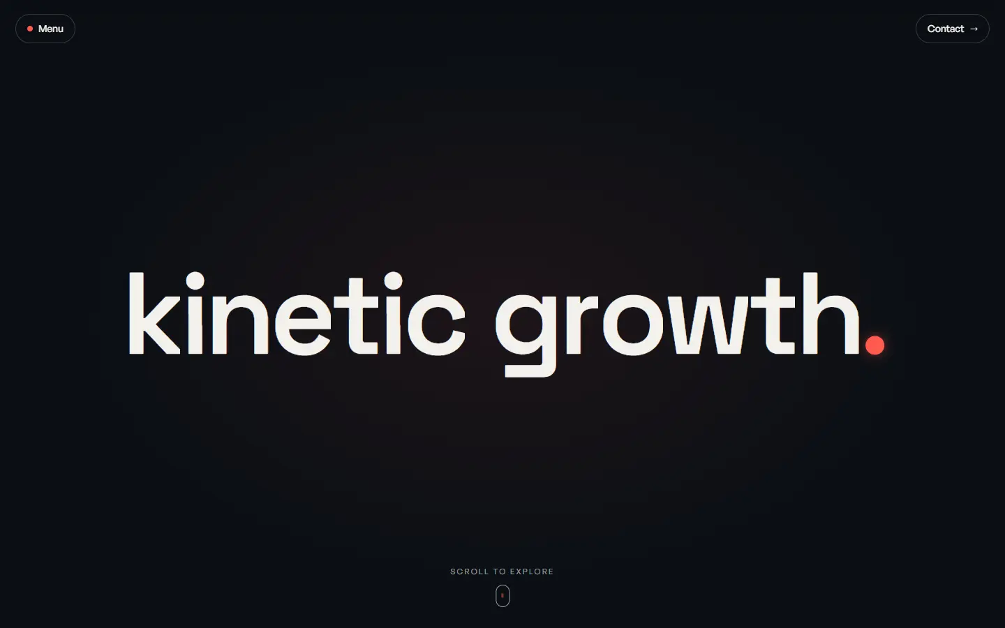

The brief
Kinetic Growth Co. is a fictional marketing agency for service businesses. The site had to feel confident and premium, prove the team understands money as well as marketing, and turn visits into strategy calls.
The challenge
- 1
Agencies all sound the same, so the brand needed a signature that's instantly recognisable.
- 2
Lots to say (websites, SEO, ads, video) without turning the homepage into a list.
- 3
Proof of work had to feel substantial for a brand with no real clients yet.
Our approach
- 01
One line as the signature
The full stop in the wordmark grows into a thick coral line that frames each section as you scroll, so the brand is in every screen.
- 02
Statements before services
Big gradient headlines and a pinned "We do one thing… Grow your business" swap make the positioning land before any service is listed.
- 03
Light where the work is
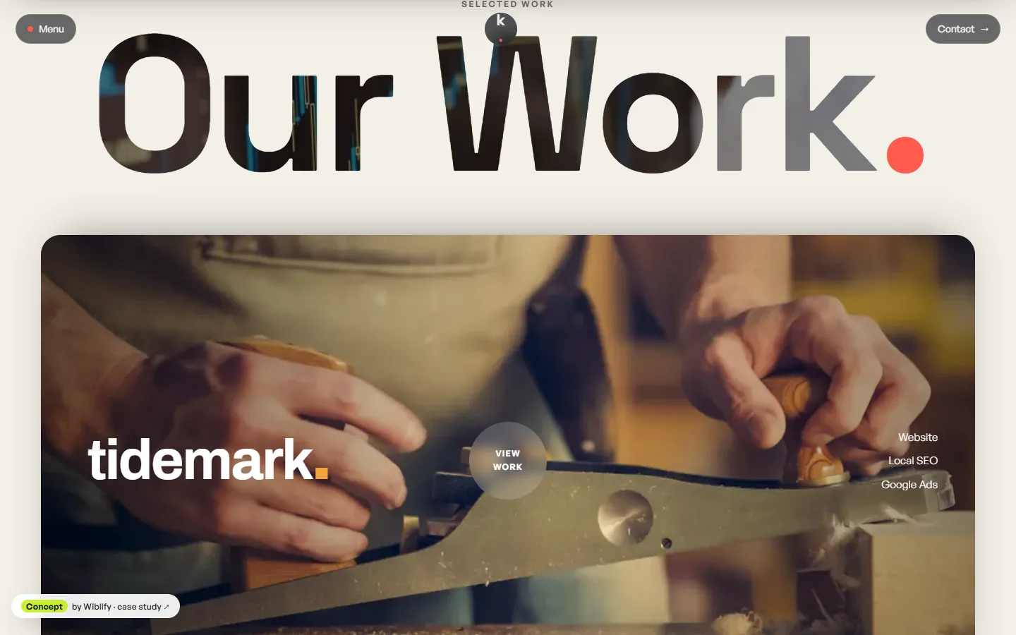
The page shifts from charcoal to paper for the project section, so the stacked project cards feel like a gallery.
- 04
Linked to the other concepts
Kinetic's "clients" are Wiblify's other concept brands, and every project card opens that concept's live site.
Brand
Charcoal and coral with an amber-to-magenta gradient: energetic and modern, but serious about results.
Colours
#FF5A4E#140F0E#FBF9F8#FFD0CB#F2EDEB
Headline typeface
Space Grotesk
An agency site that sells revenue, not vanity metrics
Logo mark
Screens
Page structure
- Wordmark hero
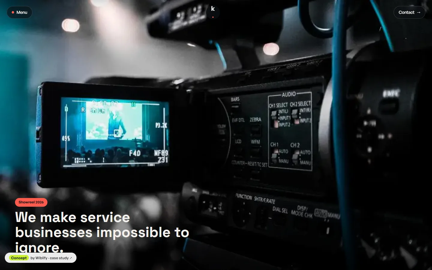
- Showreel that grows to full screen
- Positioning headline
- Client marquee
- Pinned promise statement
- Why us and our process
- Brand ribbon
- Reviews strip (sample)
- Opening magazine feature
- Services list
- Stacked project cards
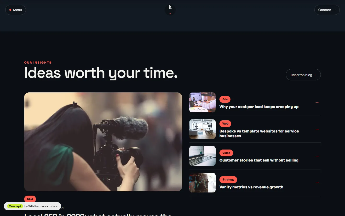
- Insights
- Closing statement
Motion and interaction
- Wordmark that builds letter by letter, then the dot pops
- Thick brand line that draws itself down the page as you scroll
- Showreel that grows from a card to full screen
- Headline gradients that shift as you scroll
- Pinned phrase that swaps halfway through
- Paragraphs that light up word by word
- Magazine cover that swings open on hover
- Dark-to-light colour shift across two sections
- Project cards that stack and shrink
This is a concept project. The business is fictional and was created to show our design work, so there are no client results or reviews to report.
Want a website like this for your business?
Start with a free audit. We'll look at how you show up today and send a fix list with an exact quote.
Get My Free Audit